No Fluff Design
Overview
The No Fluff Design Method is an iterative, first-principles, user-centric approach to product design that carefully questions each detail in the design based on usability.
If you believe that a good design is not one where there is nothing more to add, but one where there is nothing more to take away - a clean, uncluttered design where every piece of the design serves a purpose - then the No Fluff Design Method is for you.
No Fluff Design works well with Agile Development processes and budget constraints. It produces basic working results quickly, then iterates over them frequently, adding more polish and nuance at each step.
Example: Designing a Board Game
No Fluff principles are best explained by example. I chose a board game prototype as an example because I originally developed the No Fluff Design Method when I was out of my comfort zone designing a custom board game.
Disclaimer
When applied to a fast-action party game, No Fluff Design led to results that are loud and colorful. When applied to a business web site though, I would expect a much more subdued No Fluff Design.
The sample images reflect my level of proficiency in using sophisticated design software. I like to think of myself as having the mindset of a designer and the skillset of an engineer.
Step 1: the Spartan Design
The first rule/step in a No Fluff Design is:
1. Start with the most minimalist design imaginable - the Spartan Design
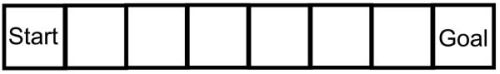
A No Fluff design begins with a Spartan Design - the simplest design imaginable. Ideally this design will look laughable. The more simple and minimalist the Spartan Design, the more assumptions you will question during your design process.
For this example, we are making a simple board that shows players advancing from a start to a goal. The simplest way to make this board is:
The next rule of No Fluff - the central and most important one - is:
2. All decisions are made for usability reasons, not aesthetic reasons
So, unless you can think of compelling ways to make the above design more usable (as opposed to prettier), this will be the final shipped product! Luckily, you should be brimming with ideas for how to make this board more usable. I will show you what my thoughts for improving this design using No Fluff principles were.
Step 2: highlighting Start and Goal
The next rule of No Fluff Design is:
3. Fix the most important usability issue first
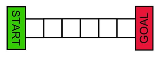
The first usability issue that immediately jumps out is that the start and goal positions have the same visual weight as the intermediate positions despite being much more important. Let's address emphasizing the start and goal:
Let's look at my thought process, keeping in mind the central rule that all decisions are made for usability reasons, not aesthetic reasons:
I enlarged, colored, and capitalized the start and end fields for maximum visiblity.
I rotated the goal text to run opposite to the start text to maximize legibilty from all angles - it is fair to assume that players will look at this board from different angles, so it should be equally legible from the front as well as back.
Bright primary colors were an obvious choice to maximize visibility of the start and goal fields (red, green, yellow, light blue). I chose red and green because we intuitively interpret green to mean 'start' and red to mean 'stop', which fits the function of the fields perfectly. I made the colors as bright as possible without being strenuous to look at. There is remaining detail work to be done for text legibility, but it does not stand out as the single most important detail at this point.
Step 3: highlighting the intermediate fields
The fields in between the start and goal do not stick out enough -they tend to blend in with both the background and adjacent fields. Let's fix this:
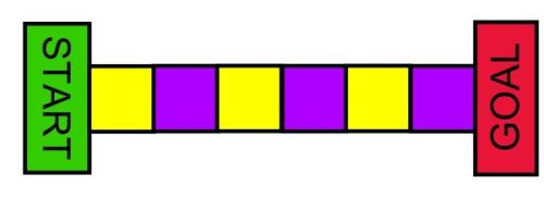
The intemediate colors were chosen for usability reasons. I wanted adjacent fields to be as different from each other as possible to make them easier to distinguish, and also to stand out from the background and from the start/goal fields. Shades of gray and yellow / purple stood out as the most effective combinations to achieve all of these goals.
I had alternate designs using more than two colors for intermediate fields, but I discarded them because of the next rule of No Fluff Design:
4. The simplest solution wins
I had to eliminate designs with more than two colors because they are more complex. If I had picked a design with 3 alternating colors instead of 2, for example, then one of those colors would not add anything to the board's usability and be gratuitous, violating the nature of No Fluff and of good design in general.
Red and green would have been the simplest color choices, since they do not add additional colors to the board's design. But the problem is that they would de-emphasize the start and goal pieces, thus taking away from our previous feature. Which brings up the next No Fluff principle.
5. A new feature should not take anything away from an existing feature
Step 4: background
So far, the background of the board has been white. Is this really the ideal background? Almost, actually - a white background suitably draws attention to the foreground elements instead of to itself. Perhaps it is possible to create a background that emphasizes the foreground even more though. After a bit of experimenting, I changed the background to this:
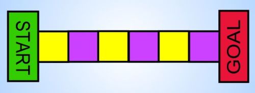
The most important detail is that the background is not too close in color to any of the board colors (see Rule 5). I have found that only gray tones and very bright blue tones work for this. I chose blue because gray tones deemphasize the black outlines of the board spaces more than blue tones do.
It is an often overlooked detail that the primary purpose of a background is to bring foreground elements forward, as opposed to drawing attention to itself. I added a skylike gradient to the background - as if a light were shining on the game board from behind - in an attempt to bring the foreground to the front as much as possible.
Step 4 and a half: stuck already?
Let's now consider the final concept in No Fluff Design:
6. When in doubt, leave it out
Every design change should be a definitive overall improvement. If you have mixed feelings that a design is better in some ways but worse in others, leave it out. If we have trouble finding clear functional improvements, we should consider our job done and move on to the next design.
An interesting detail happens at this point in the design: it becomes difficult to add new features. I did have more ideas for how to improve the usability of this board, but I had reservations about each of them, and the many No Fluff rules and constraints were preventing progress even though the design is not ready to hit the shelves of toy stores. So, now what?
This raises a crucial point in design - gathering requirements. So far, we have made a generic board. We have no idea from looking at the above design what kind of game this is. What is the name of the game? Is it primarily for adults or kids? For men or for women? Is it a fast action game or a slow strategic game? Is it for 2 players or for 20? Is it a race between people or between racecars? What is my motivation for getting to the end? We do not yet know anything about the theme and target audience of the game we are designing. If we use No Fluff, we cannot make any assumptions about these, so we are stuck with a drab and generic design until we find out more about what kind of game we are developing. Knowing the answers to the above questions would certainly give us more ideas for how to improve the design.
Step 5+: customizing and theming
This is where we change from designing a generic board to designing a board with a specific game in mind. For this iteration, I will give a real-world example:a game I made called WordBurst. WordBurst is a word game for 2-20 players that is best played in large groups at parties. The action is frenzied and chaotic, almost explosive, hence the name of the game. So, let's customize our board so that we have a board for not just any game, but for an explosively fast and chaotic party game called WordBurst:
.jpg)
I chose the Jokerman font because it matches the festive party nature of the game.
I could have written the name of the game separately at the top or bottom of the board, but integrating it into the board spaces seems simpler because it does not take up any extra space.
I also jumbled up individual letters with offsets and rotations. This makes the text look like it is about to burst, matching the explosive theme of the game and design.
I used complementary colors and black outlines on each letter for contrast and legibility.
the sunburst effect in the background serves two purposes: it brings the board into the foreground, making it more visible, and at the same time reinforces the explosive / bursting theme.
There is no end to using No Fluff to keep improving it. Given more time and artistic capabilities, I would experiment with these ideas:
- polish / tweak the sunburst effect to look more realistic and draw more attention to the game board instead of itself
- improve text legibility by finding a better balance between a festive vs legible font and tweaking the design's colors
- fill text and board spaces with a brushstroke effect rather than with a uniform solid color, matching the lively chaotic party theme of the board as well as the style of board space outlines
Summary
Let's recap the principles of No Fluff design as encountered in our board game example:
- Start with the most minimalist design imaginable - the Spartan Design
- All decisions are made for usability reasons, not aesthetic reasons
- Fix the most important issue first
- The simplest solution wins
- A new feature should not take anything away from an existing feature
- When in doubt, leave it out
Why the No Fluff Design Method Works
No Fluff looks great
When I create a design off the top of my head and a design that uses No Fluff, I found that the No Fluff design looks much better. This is profoundly ironic considering that No Fluff explicitly shuns visuals in favor of functionality and simplicity. But function and form are more interconnected than one would think, as are simplicity and beauty, so No Fluff counterintuitively creates visually appealing results not despite, but because of its focus on usability and simplicity. For real-world proof that simplicity and usability can look great, just look at Apple products or Google Material user interfaces.
No Fluff Eliminates Clutter
Not only will No Fluff get rid of clutter, but clutter will never even make its way into a product that was designed using a rigorous No Fluff approach. By reducing clutter, No Fluff also reduces costs and reduces confusion in the user experience.
No Fluff is Iterative
No Fluff will create a workable solution - though a Spartanic one - quickly and maximize the amount of time you can experiment, gather feedbak, and rethink designs. This is the same philosophy that drives Agile Development.
A related benefit is that if a project's budget falls short or expenses are overrun, there will still be a workable product in the end.
No Fluff Questions Everything
As a designer using No Fluff, you will need to question every decision you make, including some that you would never question otherwise - especially when starting with a laughably minimalist Spartan Design. Why should your button be rectangular? What size and shape makes a pushbutton easiest to push, and how far should the button go down when it is pushed? What is the most useful size, shape, and position for the doors and windows of a room? This way of thinking is a great exercise because it forces you to make decisions very deliberately, and to research your decisions from a usability perspective before moving forward with them. It forces you to think like a 4-year-old, always asking the question 'why?' on behalf of the end user. This is great not just because it is educational for the designer, but also because it ensures designers will keep their designs fresh by questioning old assumptions and habits.
No Fluff is General
No Fluff is not particular to any kind of product, so if you get creative you can use No Fluff to design anything, including the kitchen sink. Let that sink in.
No Fluff is Neverending
No Fluff does not imply that a design will be drab or boring - there is no limit to how many times you can iterate over a design and find a way to improve its usability, so you can indeed end up with rich, sophisticated designs using No Fluff - as long as nothing in your design is gratuitous.